New year New branding for Burger King!
It is obvious that you might have heard about Burger King rebranding. If you haven’t, then let me tell you. Burger King has come up with new branding to strengthening its restaurant experiences in the QSR industry across the world.
The rebranding was done by Jones Knowles Ritchie creative agency based in London. It got featured in Fast Company, Ad Age, Adweek, Deezen, Dieline and many other sites.
Recently, Burger King had launched an IPO in India which was successful and now— rebranding.
Well, the new branding will have some strategic impact on the growth of the company, but let us look at the beautiful visual identity of it.
In this blog, I will discuss about 4 things one should notice as a designer:
- Logo
- Color Scheme
- Typography
- Visuals
Logo: New but familiar
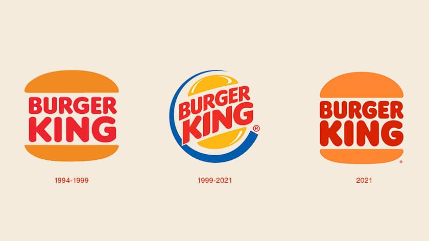
Do you find any similarity between the first one and the third one?
Yes. That’s because the first one is their former logo.
Check out this blog to find out courses on logo design and branding.
The new logo is quite influenced by its old logo which they had from 1969-99. Apart from red color, the new logo has orange which differs from old logos. But the blue swoosh is completely missing, giving it a more stable appearance. The type inside is finessed and polished so that is more readable. Overall soft and round corners are maintained in the logo which makes it friendly and approachable.
Color Scheme: Warm and friendly
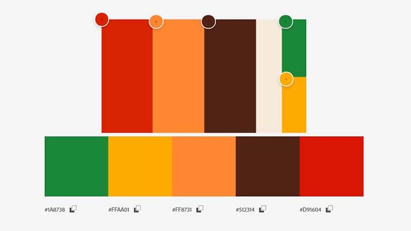
Now coming to colors, it has also got major updates. Previously, Burger King used a triadic color scheme— red, yellow and blue.

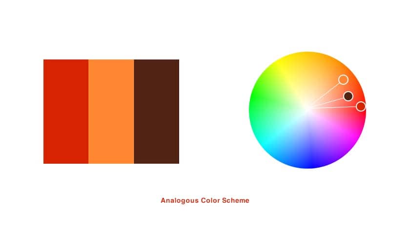
With its new rebranding, the color scheme seems to be analogous (neighbouring colors) which are— red, brown and orange.
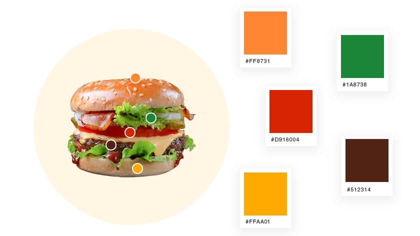
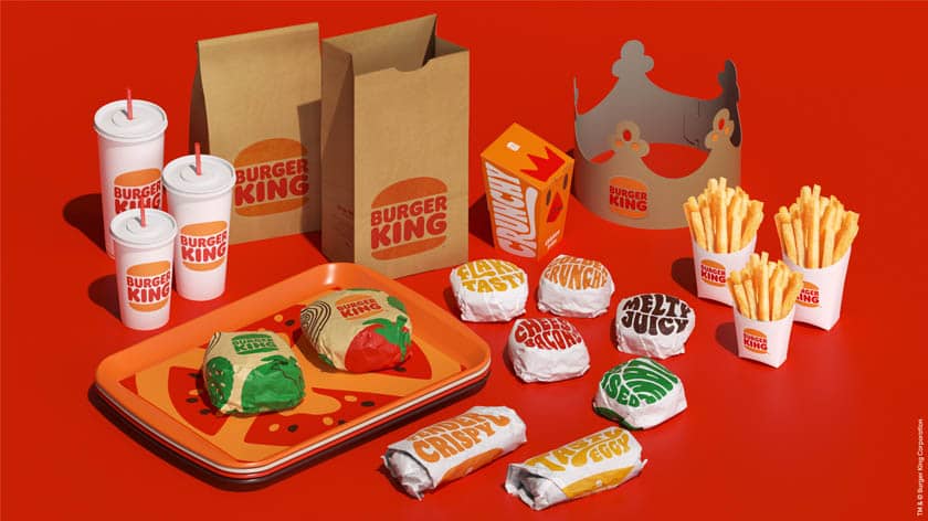
If you look close, then you can see that the color a burger prominently inspires the color palette. The primary colors are Red, Brown and Orange. The secondary colors being green, yellow and cream-white.
The use of red increases craving for food, orange makes it friendly and brown makes it warm and reliable.
Kinetic and Expressive Typography
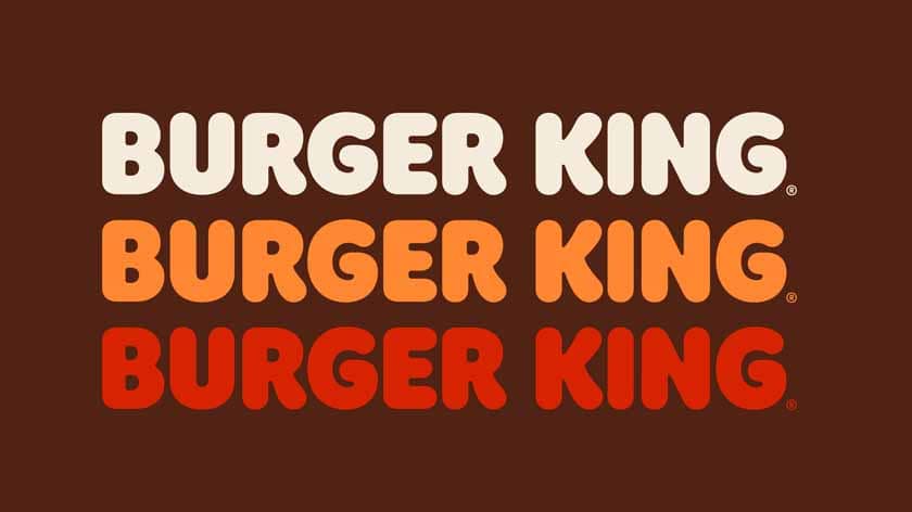
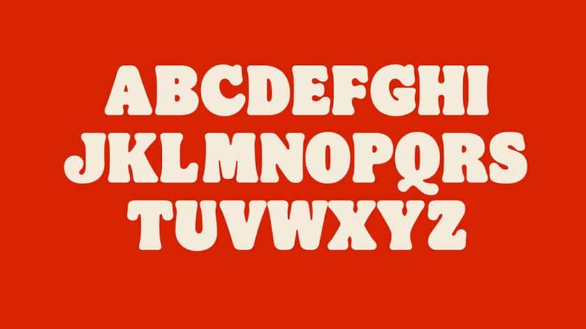
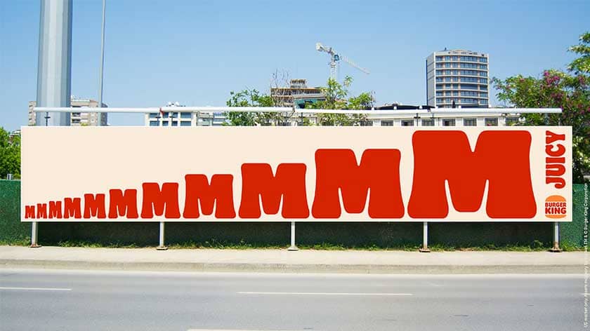
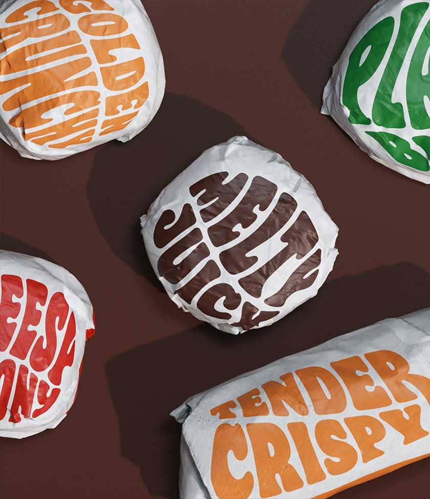
How one can miss the typography in the new Burger King rebranding! Blobby and meaty text make it perfect to be used for a burger and fast-food restaurant. Burger King uses a custom typeface which is Flame. It has various fonts such as Flame Bold, Flame Regular and Flame Sans.
The combination of expressive and kinetic typography take it to another level and will make you crave. I will consider this as the best part of the entire visual identity.
Visuals: In-your-face photography
According to JKR,
“To celebrate Burger King’s big leap forward, we introduced an in-your-face photography style that uses big, dramatic close-ups to get people to crave the food…”
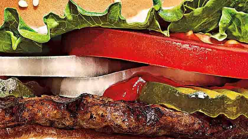
I have mixed feelings about this new style of photography. But nevertheless, it will be much more clear in future iterations.
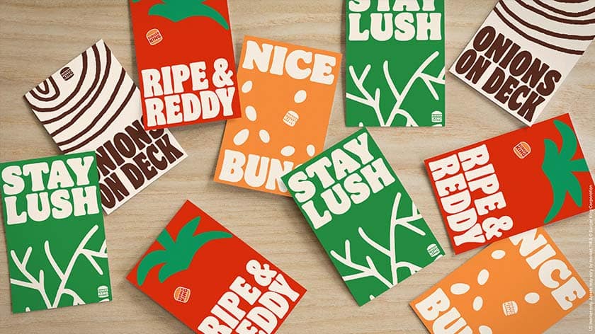
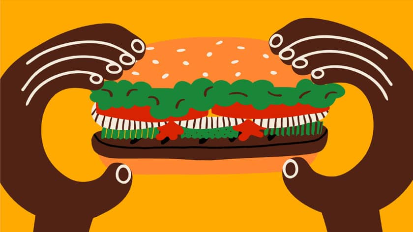
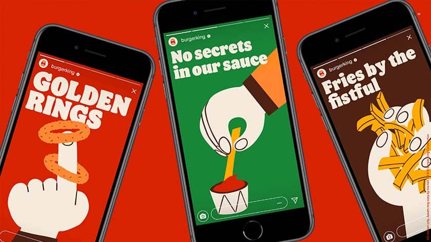
On the other hand, the illustrations are playful and doodle-like. The color palette is wisely used making it more cohesive with the new branding of Burger King.
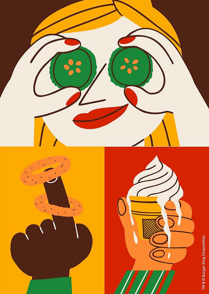
The use of bright red and dark green may give you a Christmas vibe.
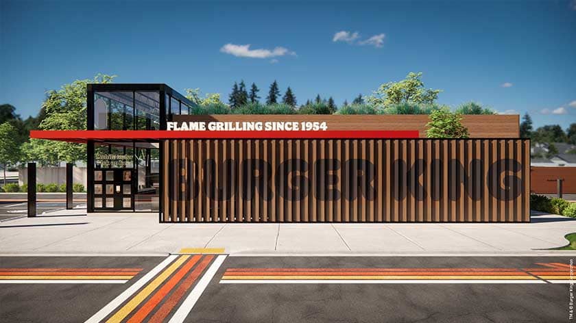
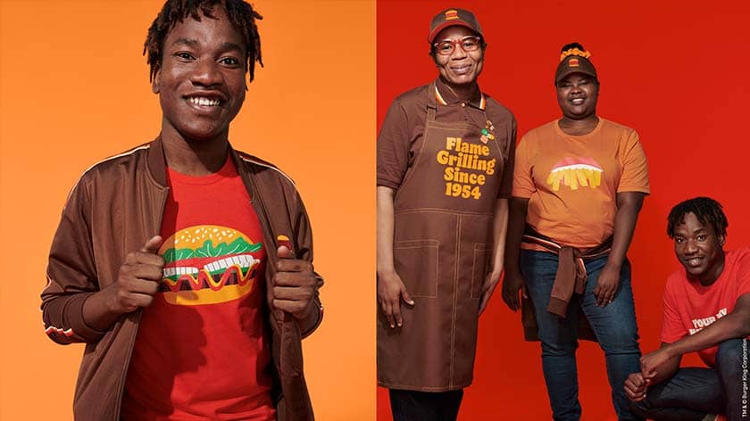
Now let us feast our eyes through some other brand applications to get a better understanding of the visual identity.
![Burger King Rebranding: 4 Things to look out as a designer 10 Best Fiverr Learn Course Bundles for Designers [20% coupon code]](https://mlezctojouax.i.optimole.com/cb:Rbc9~4c714/w:300/h:169/q:mauto/f:avif/https://lkdasofficial.com/wp-content/uploads/2021/07/fiverr_course_bundle_cover_image.jpg)

Conclusion
It was fun, looking at the Burger King rebranding as a designer. While the opinions in this blog are personal, I would like to know your views on the same. Do you agree with me? Or disagree?
If you do agree or disagree, please let me know in the comments section below!
References:
- https://www.jkrglobal.com/case-studies/burger-king/
- https://www.fastcompany.com/90591634/burger-king-unveils-its-first-major-rebrand-in-20-years
- https://thedieline.com/blog/2021/1/7/jkr-refreshes-burger-king-and-its-so-juicy-youll-need-some-napkins
- https://www.businesswire.com/news/home/20210107005111/en/Burger-King®-Evolves-Visual-Brand-Identity-Marking-the-First-Complete-Rebrand-in-Over-20-Years
- https://www.dezeen.com/2021/01/09/burger-king-logo-rebrand-jones-knowles-ritchie/
All images and media belongs to respective owners and brands.
